Introduction
In this guide, we will be building a basic pricing table. Pricing tables are commonly used for conveying the prices and features of subscription plans. Clean looking product tables are a great way to help your users subscribe to your services.
Getting Started
To start, let’s create a folder and a file inside named index.html. Feel free to create the folder anywhere you wish, we won’t be needing a web server for this.
Open up your index.html file, and add the following HTML boilerplate code:
<!DOCTYPE html>
<html>
    <head>
         <meta charset="utf-8">
         <title>Pricing Table Example</title>

         <link href="https://fonts.googleapis.com/css?family=Raleway|Rubik&display=swap" rel="stylesheet">
         <style>

             html, body {
                 margin: 0;
                 padding: 0;
             }

             body {
                 background: #f1f1f1;
             }

             .wrapper {
                 width: 100%;
                 max-width: 960px;
                 margin: 0 auto;
             }

         </style>
    </head>

    <body>
        <div class="wrapper">

        </div>
    </body>
</html>
Navigating to our newly created index.html file in the browser, we should see:

If you’re not sure what’s going on with the boilerplate code, I would recommend you check out my HTML Beginner Blocks course and CSS Beginner Blocks course. So far, we wrote out the basic code for our HTML file. All we’re doing is setting the character set, title, and setting up some basic style rules between our tags.
Flexbox Parent
Many times when there is a pricing table on a website, there are a few plans to choose from. We will be using flexbox, part of CSS, to display the boxes of our pricing table. Flexbox is very flexible and allows us to align items how we like. The first thing we need to add to our wrapper is a element with a class named pricing-table-flex. Add the following inside your wrapper :
<div class="pricing-table-flex">

</div>
Next, we will be defining some style rules to specify that we want our element to use flexbox. Add the following under our .wrapper style rule between the tags.
.pricing-table-flex {
    display: flex;
    flex-direction: row;
    flex-wrap: wrap;
    justify-content: space-between;
}
Flexbox Children
Then, we will need to define elements for each of the plans we will add to our pricing table. Inside the div with class pricing-table-flex, add the following divs:
<div class="pricing-plan">

</div>

<div class="pricing-plan">

</div>

<div class="pricing-plan">

</div>
We will want to make each of our plan boxes white. In addition, we only want our boxes to take up a maximum width of 30% of the parent . After the .pricing-table-flex rule, add:
.pricing-plan {
    background: #ffffff;
    width: 100%;
    max-width: 30%;
}
Inside each of these plan divs we will need to add a div to apply padding to our boxes. Additionally, we will need to also add an unordered list, and finally a button to each of our boxes. Add this code to each of the divs we added above:
Adding Padding
<div class="pricing-plan-padding">

</div>

<ul class="pricing-plan-features">

</ul>

<div class="pricing-plan-padding">

</div>
We will step through the code that will go inside each of these elements, one at a time. First, inside the first div with class, pricing-plan-padding, add the following code:
Adding Plan Information
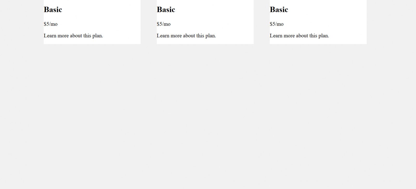
<h2 class="pricing-plan-heading">Basic</h2>
<p class="pricing-plan-price">$5/mo</p>
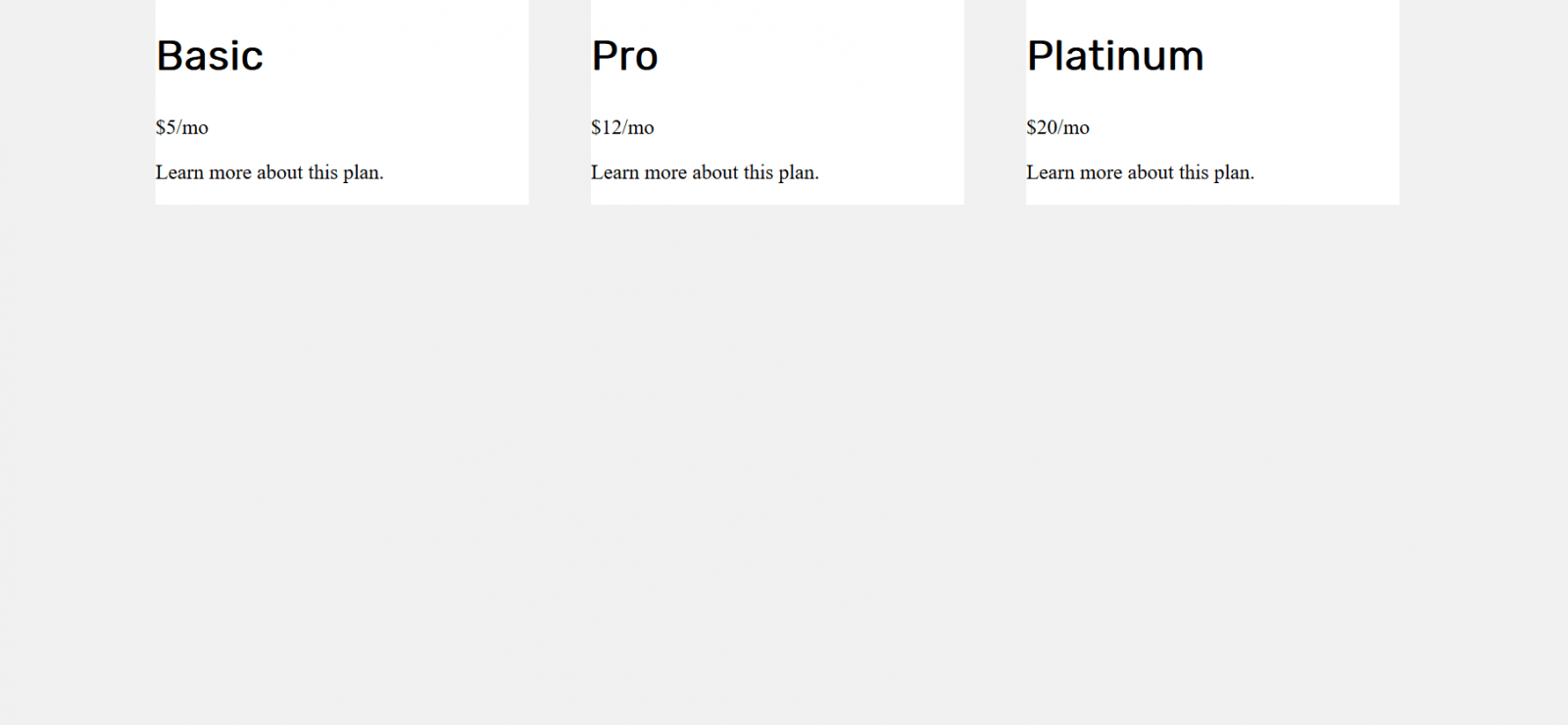
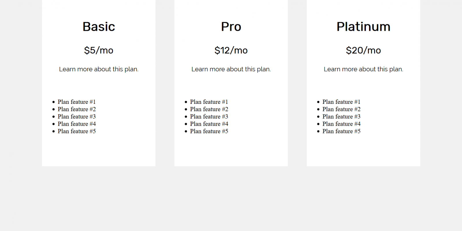
<p class="pricing-plan-info">Learn more about this plan.</p>By default HTML is rendered from top to bottom. This is why we define a heading with the name of our plan first. Then, we add the price of our plan. After that we add a small description for our plan. Make sure you added the above code to each of the boxes we’ve created. I named my payment plans: Basic, Pro, and Platinum. Then I assigned prices to each. So far we should be seeing:
Let’s add style rules for the element and both paragraph elements. Starting with the heading, add the following rule to our styles:
.pricing-plan-heading {
    font-family: "Rubik", sans-serif;
    font-size: 2em;
}
Next, we will want to define the font, as well as adjust the font size of the price of each plan.
.pricing-plan-price {
    font-family: "Rubik", sans-serif;
    font-size: 1.5em;
}
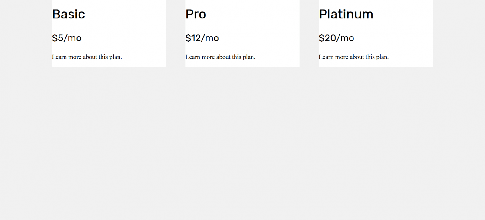
For the summary of each plan, we can add a style affecting the class, .pricing-plan-info.
.pricing-plan-info {
    font-family: "Raleway", sans-serif;
}
Feature List
For each plan, we will also want to include a small list of features. This is where the unordered lists we’ve added come into play. Add this block of HTML inside each element:
<li>Plan feature #1</li>
<li>Plan feature #2</li>
<li>Plan feature #3</li>
<li>Plan feature #4</li>
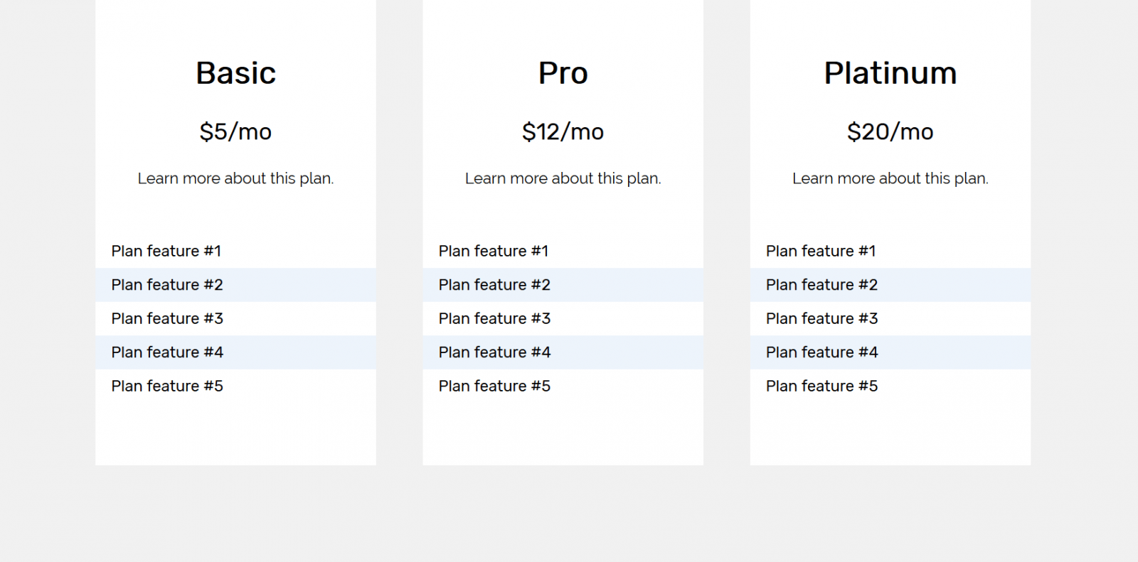
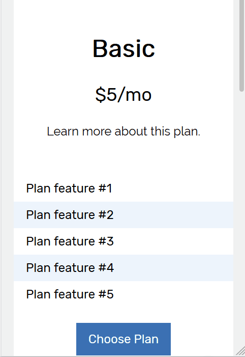
<li>Plan feature #5</li>Now we will need to add styles for the elements we added above. After our .pricing-plan style rule, add the following CSS to set the padding for each of our box plans.
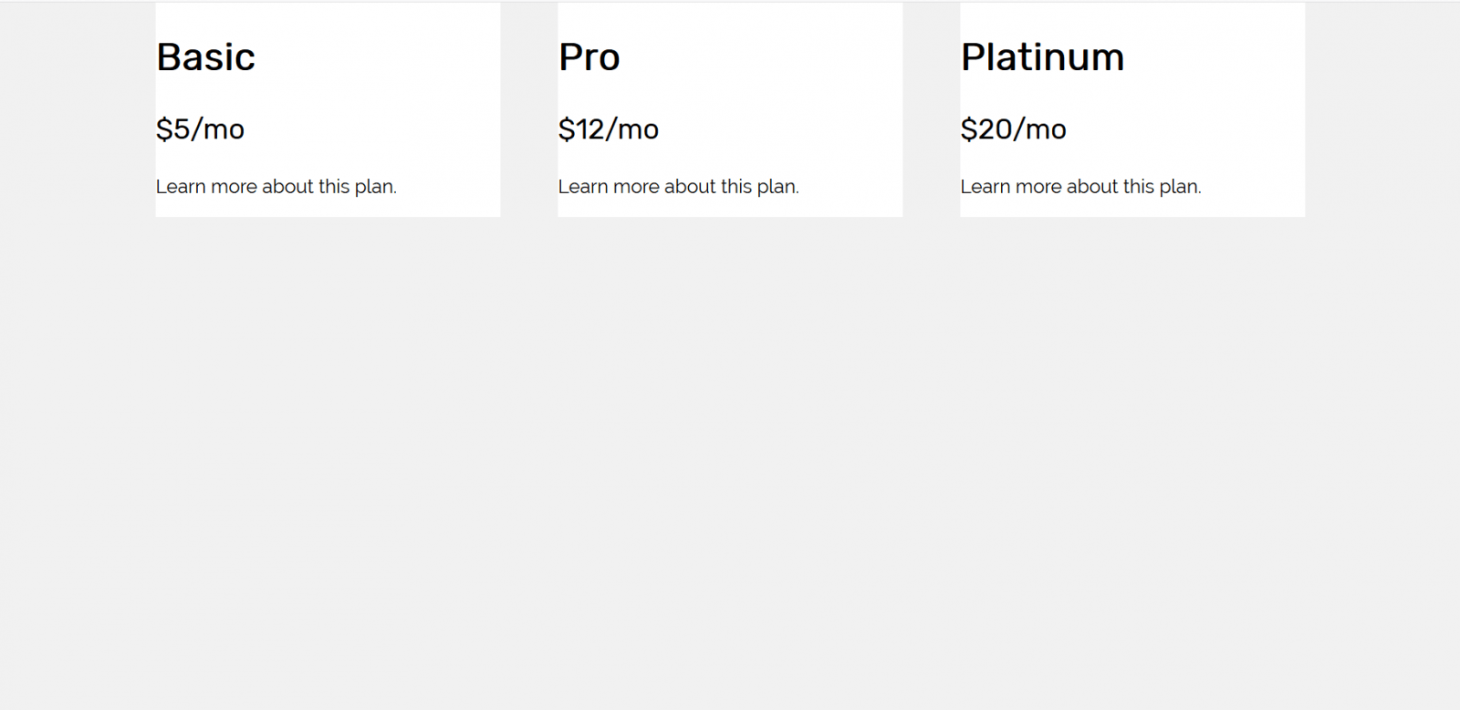
.pricing-plan-padding {
    padding: 32px;
    text-align: center;
}
At this point, we should see something like this.
For the feature list of each box, we can add the following to our style rules:
.pricing-plan-features {
    margin: 0;
    padding: 0;
    list-style-type: none;
    font-family: "Rubik", sans-serif;
}

.pricing-plan-features li {
    padding: 8px 16px 8px 16px;
}

.pricing-plan-features li:nth-child(2n) {
    background: #edf4fc;
}
In the above code block, first we are defining some styles for the element representing our feature list. By default, unordered lists display bullet points next to each item. We can remove that via the list-style-type: none; line. We also set the font we wish to use with our feature list. In the second style rule, we are setting the padding of the feature list. The line we wrote includes the shorthand property for defining the padding in each direction for the element. For example, to represent the padding we added above, you could write:
padding-top: 8px;
padding-right: 16px;
padding-bottom: 8px;
padding-left: 16px;
But we can add a line that trivially handles these values for us without adding directions. The arguments we are providing the padding style is as follows:
- The first argument represents padding-top.
- The second argument represents padding-right.
- The third argument represents padding-bottom.
- The fourth argument represents padding-left.
We can also shade every other item of our feature list. We accomplished this by appending :nth-child(2n) to the end of our .pricing-plan-features li rule. That’s where we used the background property to define a background color.
Adding Call-to-Action Button
Next, we will add the button to each of our plan boxes. Inside the last div with class .pricing-plan-padding in each box, add:
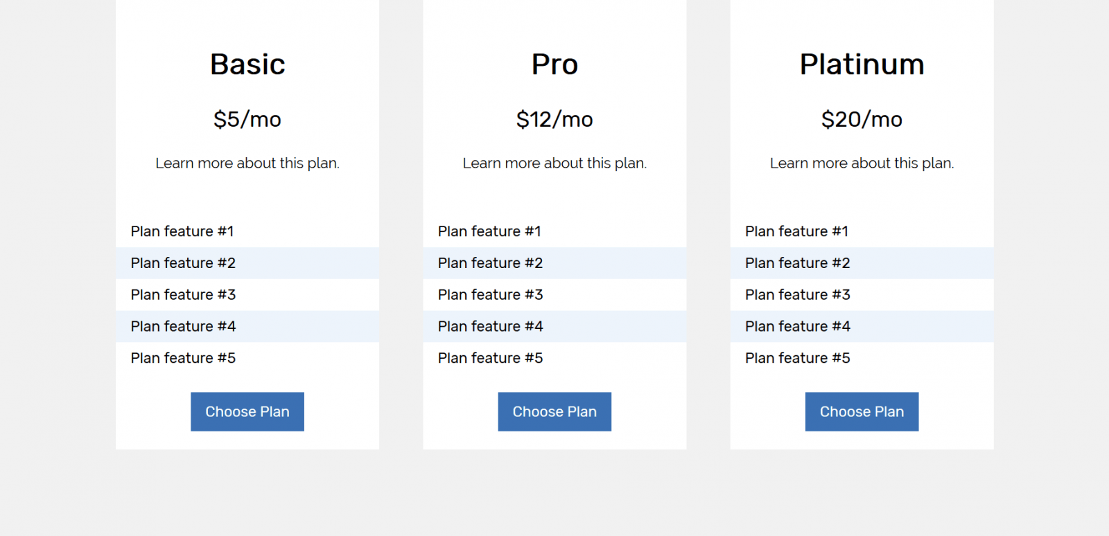
<a class="btn-plan" href="#">Choose Plan</a>Perfect! We now have our “Choose Plan” buttons, now we just need to make them look fantastic.
Under our last style rule, add the following:
.btn-plan {
    color: #ffffff;
    background: #3B70B3;
    padding: 12px 16px 12px 16px;
    text-decoration: none;
    font-family: "Rubik", sans-serif;
}
There we have it! It looks great on desktops and laptops, but what about mobile devices?
Mobile Optimization
Let’s take a look at what we have with the Reponsive Design Mode of Firefox.
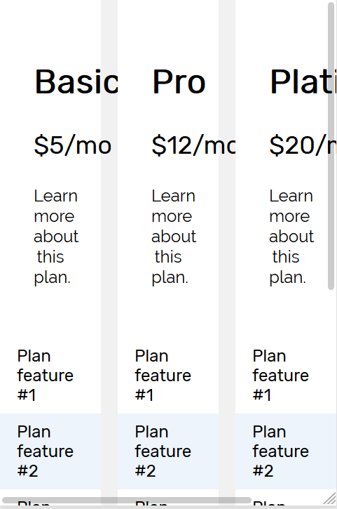
Oof! It doesn’t look great, does it? We can fix this up on mobile devices with the use of CSS media queries! Media queries are the bread and butter of mobile optimization on the web. This is the last CSS we have to add between our tags:
@media screen and (max-width: 640px) {
    .pricing-table-flex {
        flex-direction: column;
    }

    .pricing-plan {
        max-width: 90%;
        margin: 0 auto;
        margin-bottom: 32px;
    }
}
Media queries allow us to define styles that are applied when a condition is true. Above, we are applying some styles only to the screen (not to be printed, etc.), and activate when the screen size is less than 640 pixels.
If we take a look at our page again with Responsive Design Mode or Chrome Web Tools, we should see something similar to this. Congratulations, you build a pricing table and made it mobile optimized!
Hopefully this guide has been helpful for you. The HTML file for this tutorial can be downloaded here. You may be interested in taking a look at our other website design tutorials. To receive news regarding new tutorials and courses we release, be sure to fill out the form. If you found this tutorial valuable, sharing it on your favorite social media platform would be highly appreciated.