In this tutorial, we will be taking a look at some of the common image filters that are available with CSS. Note, the syntax used in this tutorial may be outdated in the future. The specification seems to still be a working draft as of June 11, 2019. It is my hope that this guide will help you try out this nifty feature of CSS!
First, let’s create a folder somewhere and add a new file inside named index.html. Open this file with your code/text editor of choice. Lately I’ve taken a liking to Visual Studio Code, but anything works.
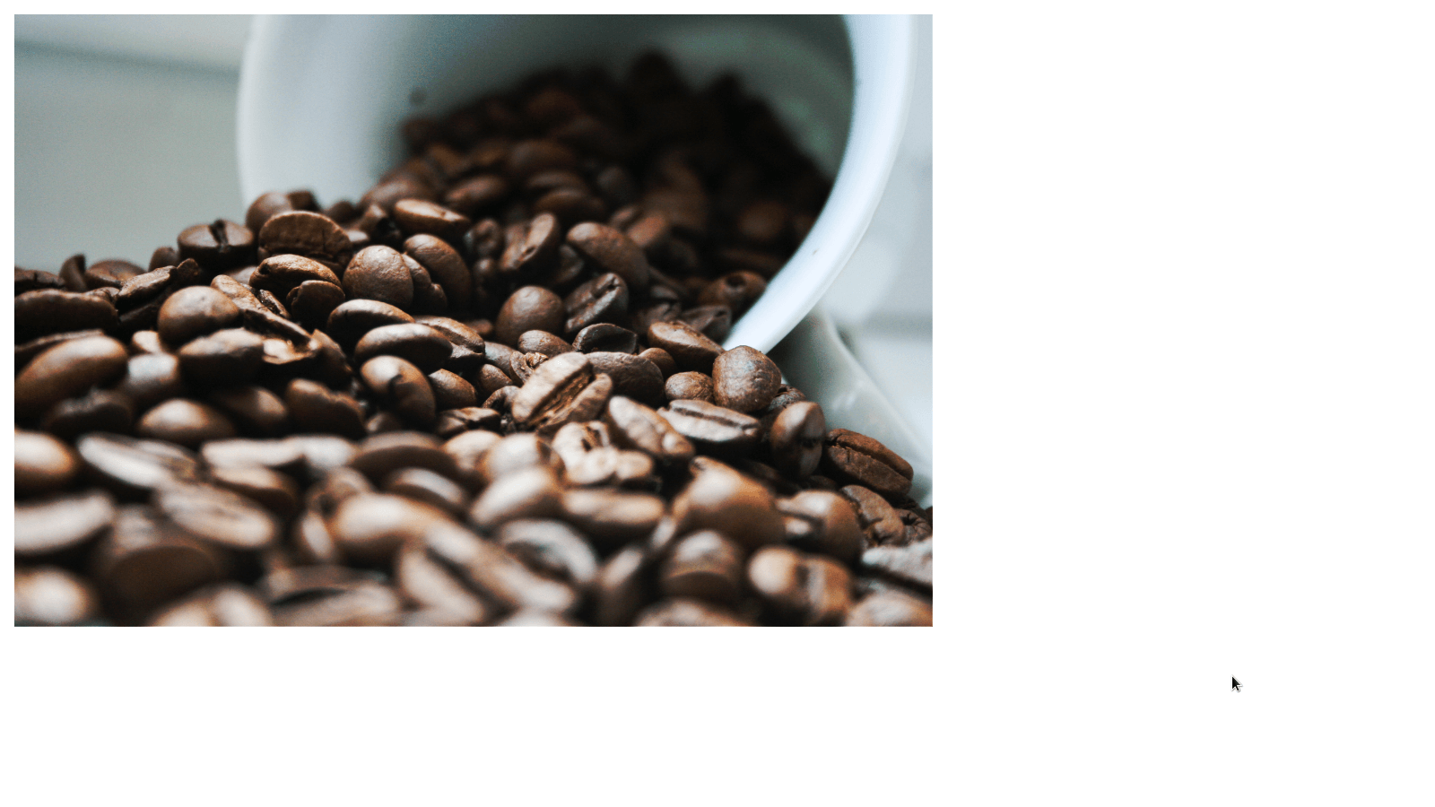
We will also need to find an image that we want to manipulate with our image filters. The image we use can either be downloaded or alternatively, we can use the URL of the image on the web. For the purposes of this tutorial, feel free to grab a URL for an image you like. We will need this URL in a minute.
In your index.html file, add the following to create the basic markup for our web page:
<!DOCTYPE html>
<html>
  <head>
    <title>Image Filters</title>

    <style>
      /* Add CSS styles here */

    </style>
  </head>

  <body>

  </body>
</html>
Between the tags, add the following markup for adding our image:
<img id="photo" src="<the URL of the image>">Of course, you will need to add the URL of the image between the quotes of the src attribute.
Next, between the tags in the element, add the following style rule:
#photo {
width: 512px;
height: auto;
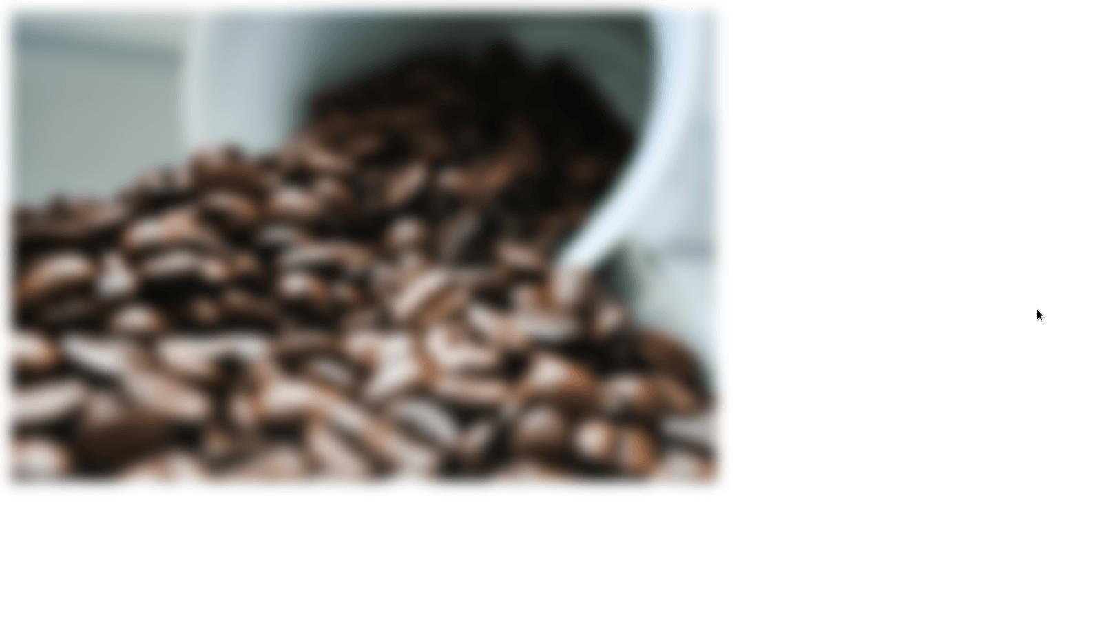
}Let’s start by experimenting with the blur filter. Before I get ahead of myself, I should explain that filters can be utilized via the filter property. Now, to add a blur to our image, we can use this filter property and set it to blur(5px); Add the following line to our style rule:
filter: blur(5px);We should now see the following result:
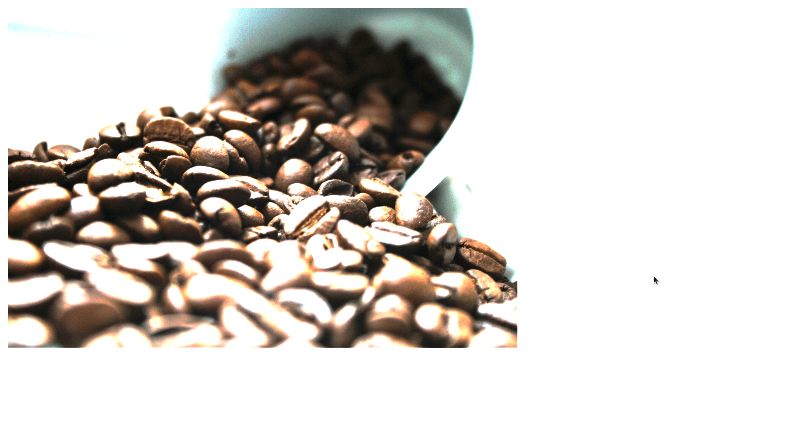
Another commonly used filter is the brightness filter. You can set a percentage below 100%, for darkening an image, or you can set a value above 100% to brighten a picture. Below, I brighten the photo using the line:
filter: brightness(200%);
What if we wanted to adjust the contrast of an image? This is pretty trivial too! You can change the line with our filter property to the following:
filter: constrast(200%);
Another filter that we can use on our websites is the saturate filter. This filter, well… simply saturates the image. Pretty nifty! We can change the line with our filter property to the following:
filter: saturate(200%);

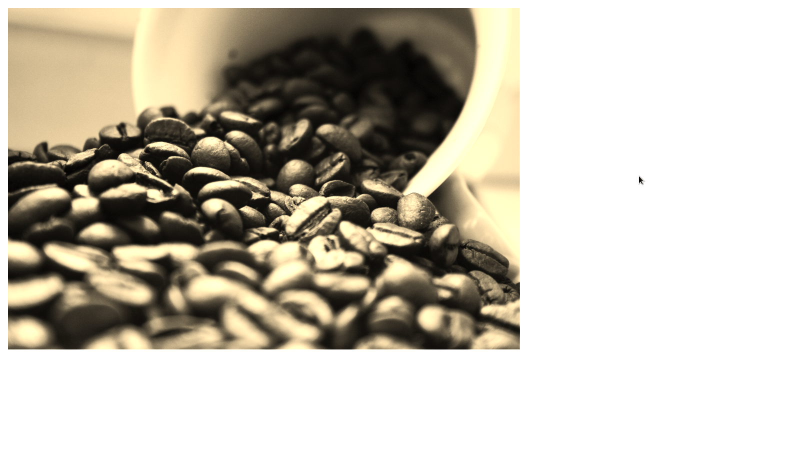
You might find the need to color your image with a sepia tone. No problem! We can accomplish this by using the sepia function as follows:
filter: sepia(200%);
Before we wrap up, I want to mention that you can also combine filters like so:
filter: brightness(180%) contrast(110%) saturate(160%);At we can achieve the following result:
With that, you now know a handful of the commonly used CSS filters! These filters can really help spruce up your website, so experiment and try them out. If you found this tutorial useful, and would like to receive news on future tutorials and courses we make, be sure to fill out the form. Sharing this tutorial is also very helpful and much appreciated.