In this tutorial we will show you how to create feature boxes with HTML and CSS. Feature boxes are common on many websites and help summarize services or products a business offers, etc.
The final result will look like the following:
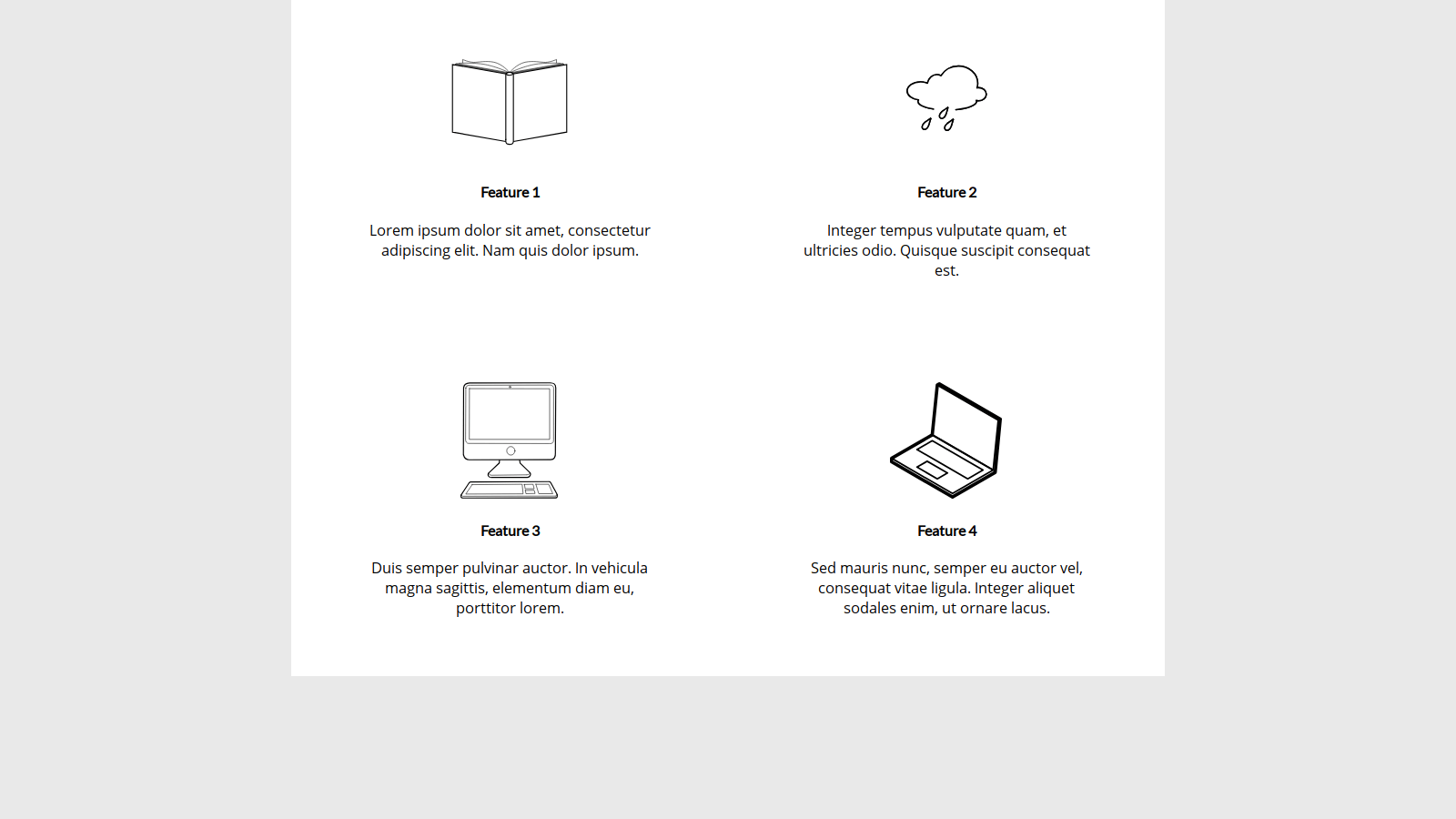
Before jumping into the code, it will be useful for you to download the images folder containing the icons shown above for our feature boxes. You can download the ZIP file with the images folder and associated icons here.
The first thing we’re going to do is create a directory for our project. Create a folder somewhere and name it whatever you want. Inside that folder another folder called css. Extract the ZIP we just downloaded, and move the images folder into our project directory. Inside the css folder, add a new file named styles.css. Then, in our main project folder, create a new file named index.html.
Next, open our index.html file with any text editor or code editor and add the following to define the basis of our HTML document:
<!DOCTYPE html>
<html>
  <head>
    <meta charset="utf-8">
    <meta lang="en-us">
    <meta name="viewport" content="width=device-width, initial-scale=1">

    <title>Feature Boxes Example</title>

    <link href="https://fonts.googleapis.com/css?family=Lato|Open+Sans" rel="stylesheet">
    <link rel="stylesheet" type="text/css" href="css/styles.css">
  </head>

  <body>

  </body>
</html>
Basically, we just defined some boilerplate code we need, as well as load in the fonts we’ll use. We also linked in our styles.css file.
The next thing we’ll do is define the markup for our feature boxes. If you haven’t learned about HTML or CSS yet, you can find my Beginner Blocks courses for each language in our shop. If you’re comfortable with each language, let’s proceed with creating our wrapper element. Add the following to the element of our HTML document.
<div class="wrapper">

</div>
Inside this new div, we will want to add another wrapper which we’ll use as a parent container for holding our feature boxes. This new will use the feature-wrapper class. Add this code to the wrapper div:
<div class="feature-wrapper">

</div>
For the purposes of this tutorial, we will be adding four feature boxes. Type the following code within the feature-wrapper div:
<div class="feature-box">
  <object class="feature-icon" type="image/svg+xml" data="images/icon_book.svg">
    Your browser doesn't support SVG.
  </object>
  <h4>Feature 1</h4>
  <p>Lorem ipsum dolor sit amet, consectetur adipiscing elit. Nam quis dolor ipsum.</p>
</div>

<div class="feature-box">
  <object class="feature-icon" type="image/svg+xml" data="images/icon_rain.svg">
    Your browser doesn't support SVG.
  </object>
  <h4>Feature 2</h4>
  <p>Integer tempus vulputate quam, et ultricies odio. Quisque suscipit consequat est.</p>
</div>

<div class="feature-box">
  <object class="feature-icon" type="image/svg+xml" data="images/icon_computer.svg">
    Your browser doesn't support SVG.
  </object>
  <h4>Feature 3</h4>
  <p>Duis semper pulvinar auctor. In vehicula magna sagittis, elementum diam eu, porttitor lorem.</p>
</div>

<div class="feature-box">
  <object class="feature-icon" type="image/svg+xml" data="images/icon_laptop.svg">
    Your browser doesn't support SVG.
  </object>
  <h4>Feature 4</h4>
  <p>Sed mauris nunc, semper eu auctor vel, consequat vitae ligula. Integer aliquet sodales enim, ut ornare lacus.</p>
</div><
Essentially, we’re creating four elements we’ll be using to represent our feature boxes. The icons I have added for this tutorial are SVG files, so I added them via the elements. If an SVG file couldn’t be loaded, the text “Your browser doesn’t support SVG.” will be displayed.
The next step is to add the style rules needed for the feature boxes. Let’s head over to the styles.css file. In that file, we’ll want to start by adding a little code to help make our page appear a bit more consistent across browsers:
html, body {
  margin: 0;
  padding: 0;
}
Now, we’ll also add a background color to our site. This will help make our wrapper element stand out, and many modern websites feature a light background with a white wrapper:
body {
  background: #e9e9e9;
}
Next, we’ll add the style rule for our main site wrapper:
.wrapper {
  background: white;
  margin: 0 auto;
  width: 100%;
  max-width: 960px;
}
In the code above, we make the wrapper white, we center it horizontally, and we instruct the browser to stretch it to a maximum width of 960 pixels.
Now we’ll add the style rule for the feature box wrapper I described earlier. We will be specifying we want to use CSS flexbox to display the feature boxes (which are children of the feature-wrapper div.)
.feature-wrapper {
  display: flex;
  flex-direction: row;
  justify-content: space-around;
  align-items: middle;
  flex-wrap: wrap;
}
Let’s now add the code to style feature boxes themselves. We will want them to stretch to 45% the width of the feature box wrapper, but stay less than 320 pixels in width. We will also set the padding around each feature box, and center align the heading and summary text.
.feature-box {
  width: 45%;
  max-width: 320px;
  padding: 48px 32px 48px 32px;
  text-align: center;
}
The next two style rules we’ll add affect the heading and summary text. We’ll utilize the font Lato for each feature box heading, and Open Sans for the summary in each box. If either (or both) Google Web Fonts fail to load, for example, if the user was offline, then it will fallback to the device’s default sans-serif font.
.feature-box h4 {
  font-family: 'Lato', sans-serif;
}

.feature-box p {
  font-family: 'Open Sans', sans-serif;
}
The last style rule we need to add is for the feature icons. We want the height of each icon to be constrained to 128 pixels, which will keep the headings and summaries aligned on each row of feature boxes.
.feature-icon {
  max-width: 128px;
  height: 100%;
  max-height: 128px;
}
If we open our index.html file with the browser, we should see our final result!

With that, this concludes the tutorial! If you have found it useful, please fill out the form if you would like to receive news about future tutorials and courses we release. If you have any questions, comments, or just general feedback, don’t hesitate to contact me via email, our contact form, or tweet at me @jaredyork_. It would also be much appreciated if you took a moment and shared this tutorial on your social media platform of choice with our new buttons below if you liked it.
You can also find the full source code for this tutorial on GitHub.