Hello everyone! This will be the start of my web design tutorials. In this little tutorial, we will be creating a full screen landing page.
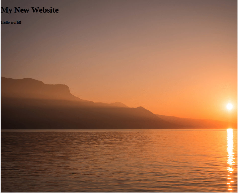
Here’s a preview of what we’ll be making:
To start, let’s head over to Unsplash so we can pick out a picture we want. I really like the sunset picture you see in the preview by Samuel Zeller (available here). When you find the picture you want to use, just click the large green “Download” button on the image preview. The image should then download. If you already have a nice big photo in mind that you wish to use, that will work just fine.
Next, create a folder we can base our project in. Inside that folder, create two more folders: images, and css. Move the image you downloaded into the images folder. Let’s also add a new file to our project directory and name it index.js. Finally, in our css folder, create a new file and name it styles.css. Let’s now start adding to our index.html file. Open our newly created index.html file with your text editor or code editor of choice. If you don’t have a dedicated code editor, you can even use Notepad or Text Edit, anything will work. Once you opened our HTML file, add the following:
<!DOCTYPE html>
<html>
  <head>
    <meta charset="utf-8">
    <meta lang="en-us">
    <meta name="viewport" content="width=device-width, initial-scale=1">

    <title>Fullscreen Landing Example</title>

    <link href="https://fonts.googleapis.com/css?family=Lato|Open+Sans" rel="stylesheet">
    <link rel="stylesheet" type="text/css" href="css/styles.css">
  </head>

  <body>
    <div class="landing-outer-wrapper">
      <div class="landing-inner-wrapper">
        <div class="landing-centered">
          <h1>My New Website</h1>
          <h4>Hello world!</h4>
        </div>
      </div>
    </div>
  </body>
</html>
If you don’t recognize what much of the above code does, I would recommend checking out my HTML Beginner Blocks course available here. Essentially, we are specifying that our file is an HTML document, we added a tag for making our website mobile friendly. We also link in the two Google Web Fonts we’ll be using: Lato, and Open Sans. Those are two modern looking fonts. Then we’re also linking in our styles.css file. Finally, we add in the HTML elements we need to make our full screen landing page work. Now, we can hop over and add the CSS to our styles.css file.
First, let’s add a few lines of code to help standardize the appearance of our web page across most browsers:
html, body {
  margin: 0;
  padding: 0;
}
We will be using a specific method for horizontally and vertically aligning the element. Let’s start by adding the following style to class landing-outer-wrapper:
.landing-outer-wrapper {
  display: table;
  position: absolute;
  width: 100%;
  height: 100vh;
}
Basically, we’re going to make the browser display our outer wrapper similar to a table. Child elements of the outer wrapper (the inner wrapper), will be affected by this. We also want our outer wrapper to stretch across the screen, hence the 100% width, and we want it to be as tall as the user’s screen, hence the 100vh height. The unit vh is the viewport height, and 1% vh represents 1% of the height of the screen.
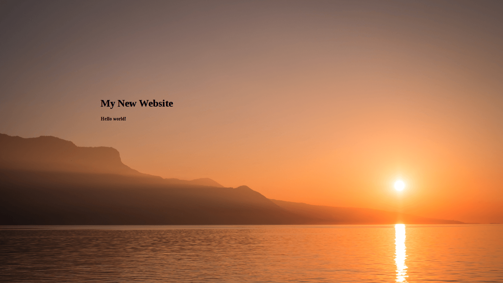
So far, if we open our index.html file in your browser of choice, you will notice the page looks pretty empty. The picture isn’t appearing in the background yet. No worries! Let’s add the following within our .landing-outer-wrapper rule, after the height property:
background-image: url();
background-size: cover;
background-repeat: no-repeat;
Now, we haven’t actually added the URL (path) to our image yet. It’s important to point out we need to write the path to our image relative to the location of our CSS file. Since the styles.css file is within the css folder we made, we have to make the path go back a directory to the root of our project directory, then refer to the images folder and our image. Obviously, if we wanted to refer to the URL of an image located online, we can simply add the URL inside the two parenthesis. However, since we saved our photo locally in the images directory, we will have provide a relative path. Here is the path I added to the url functional notation:
background-image: url(../images/samuel-zeller-19361-unsplash.jpg);Notice how I’ve included “../” before the path to the images folder, this allows us to go back a directory. We also added two other properties: background-size, and background-repeat. We want our background image to cover the div, but we don’t want it to repeat if the height of the image is shorter than the page when scaled.
Now if we refresh our browser, we should now see our photo fully covering our page.
The next step is to specify we want elements with the class landing-inner-wrapper to be displayed similar to a table cell. In this style rule we will also set the vertical alignment of the inner wrapper to be in the middle. Add the following code to create our style rule:
.landing-inner-wrapper {
  display: table-cell;
  vertical-align: middle;
}
Inside this inner wrapper div we also added a div which contains our two headings and is centered. Let’s add some more code to our CSS file:
.landing-centered {
  margin: 0 auto;
  width: 960px;
  height: 300px;
}
We have to specify the width and height of the div we’re centering, in this case a div with the class landing-centered. We’re now finished with the meat and potatoes of centering the landing-centered div.
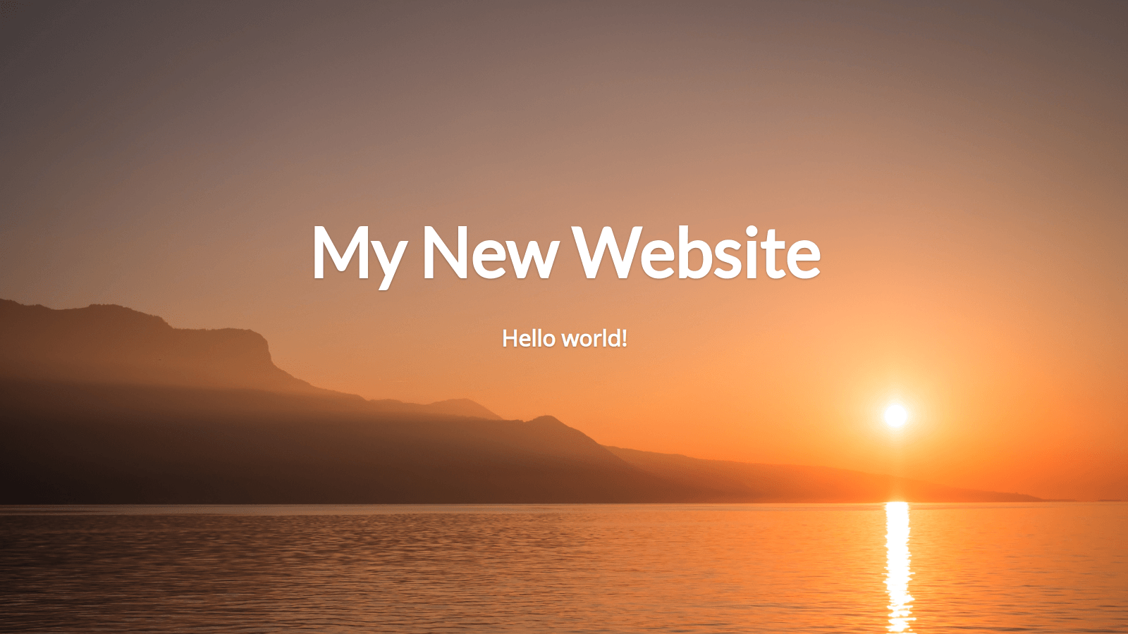
Now we just need to modernize the appearance of our text! Add the following style rules to center align our headings, color them white, and add a slight text shadow:
.landing-centered h1, .landing-centered h4 {
  color: white;
  text-align: center;
  text-shadow: 0px 1px 3px rgba(0, 0, 0, 0.3);
}

.landing-centered h1 {
  margin: 0;
  font-family: 'Lato', sans-serif;
  font-size: 6em;
}

.landing-centered h4 {
  font-family: 'Open Sans', sans-serif;
  font-size: 2em;
}
The last thing we’ll probably want to do is make our page mobile responsive. To do this, we will utilize CSS media queries. Pretty much, as the width of the window decreases below 960 pixels, we will want to decrease the font size and make adjustments to the width for some of our divs. Add the following code for our media query used for changing styles if the screen width is below 960 pixels:
@media (max-width: 960px) {
  .landing-centered {
    width: 100%;
    height: 160px;
  }

  .landing-centered h1 {
    font-size: 4.5em;
  }
}
Finally, we will want to add one last media query if the screen width is less than 640 pixels. Basically we’re performing the same instructions as the code above, but we’re making the font smaller, and also readjust the width of the landing-centered div. Add this block of code to the bottom of our styles.css file:
@media (max-width: 640px) {
  .landing-centered {
    width: 100%;
    height: 160px;
  }

  .landing-centered h1 {
    font-size: 3em;
  }

  .landing-centered h4 {
    font-size: 1.25em;
  }
}
Our final result should look like our first preview! And with that, this concludes my first web design tutorial. If you have any questions, comments, or feedback, I’d love to hear it. You can either fill out the contact form, email me at [email protected], or tweet at me @jaredyork_.
If you found this tutorial valuable, and would like to receive future updates on new tutorials and courses we release, please fill out the form. Using the share buttons at the bottom of this post to share this tutorial on the platform of your choice would be highly appreciated!
The full source code for this tutorial can be found on my GitHub.